Lazy Creatives
Looks lazy. Works obsessively. A growing family of desktop tools that take the boring, behind-the-scenes work of making music off your plate — so you stay in flow while they obsess over the details. Dark studio surfaces, soft Sloth Blue line art, a green “verified” state.
Foundation
For working producers who'd rather make music than manage it, Lazy Creatives builds the desktop tools that handle the chores — verified backups, hands-off SoundCloud uploads, and more to come — so the admin runs itself. You stay in flow; the tools obsess over the boring stuff.
Purpose
Take the tedious, behind-the-scenes work of making music off your plate — so you stay in the music.
Who it's for
Working producers, spoken to as peers — pro, never corporate.
Promise
“You make the music. We'll handle the rest — and prove it's done.”
Personality
Chill · meticulous · plain-spoken · by-makers-for-makers · quietly confident.
House-brand architecture
- Lazy Creatives is a family of music-maker tools — one look, one login, one licence (a unified dashboard / subscription later).
- Shipping: Backups (never lose a session) · Uploader (publish & manage SoundCloud, hands-off). More to come.
- One sloth, one wordmark — each tool is “Lazy Creatives — <Tool>”, never a new logo.
Two rules that protect the brand
- Always name the tool's job. The house name sets the vibe, not the function — pair it per tool: “Lazy Creatives — Backups”, “Lazy Creatives — Uploader”.
- Looks lazy, works obsessively. Voice & mascot stay chill; claims are always rigorous. Never let a cute line weaken a reliability promise.
Logo
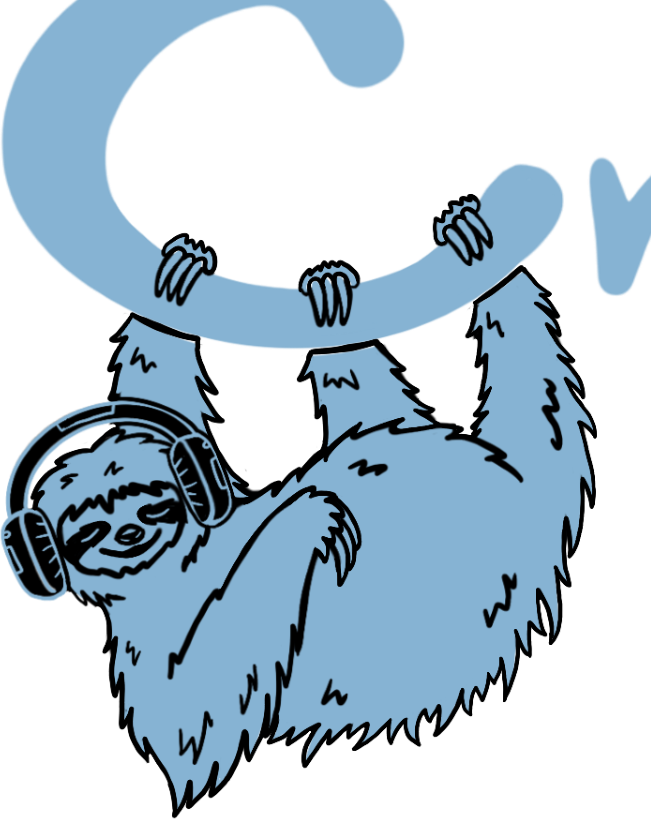
The artist's lockup, background removed → brand/logo.png (transparent). It's dark-first — the blue line art is built to sit on Studio Black / Deep Slate. Keep clear space ≥ the sloth's head all around, and the lockup ≥ 120 px wide so the wordmark stays legible; never recolour or add effects. A dark/mono version for light backgrounds is on the commission list below.
Colour
Two hues come straight from the logo: Sloth Blue #86B3D3 and Deep Slate #3B4F5D. Gold is no longer the lead — it's attention/warnings only. Green stays reserved for confirmed/verified. Contrast: Sloth Blue & Ink read clearly on Studio Black; don't set Sloth-Blue text on Deep Slate (too low) — use it as a fill with near-black text instead.
Typography
Display / wordmark: Slothy Jelly (by Scratch Design) — the logo's own typeface; use it for the wordmark and big display moments. UI & body: Inter; a monospace for hashes, counts & status. Drop the licensed webfont at brand/slothy-jelly.woff2 (or .ttf) for the specimen above to render. ⚠ Licence: Slothy Jelly is free for personal use only — buy a commercial/web licence (MyFonts / Font Bundles / Creative Market) before shipping it in the product.
Voice & tone
Taglines
How we sound
- Laid-back, plain-spoken, a little dry — never corporate.
- Short sentences. The tool brags quietly.
- Productive tension: chill exterior, obsessive interior.
- Talk to music makers like a peer, not a vendor.
In-product voice
One voice across every tool: chill tone, precise facts. Cute is fine; vague is not — numbers and “verified” carry the trust.
Assets to commission · artist brief
References for the extra art we need from the same hand, in the same single-colour Sloth-Blue line style as the logo (transparent PNG + SVG, please). The framed sloth below is cropped from the existing lockup to show the character & line weight to match.
lockup
(current)
on light
Usage
Do
- Use the logo on dark surfaces (Studio Black / Deep Slate).
- Keep clear space ≥ the sloth's head on all sides.
- Use Sloth Blue for one primary action per screen.
- Reserve Verified Green strictly for confirmed / passed states.
- Keep the sloth chill — relaxed poses only.
Don't
- Recolour, redraw, or re-typeset the logo / wordmark.
- Stretch, rotate, or drop-shadow the line art.
- Put the blue logo on a light/busy background (use the mono version).
- Use gold as a primary CTA — it's attention/warnings now.
- Use red for anything other than risk / errors.